Work.
We captured the flavour of this new business, naturally.


Crisp design and catchy copy combine to create an exciting and informative online presence.
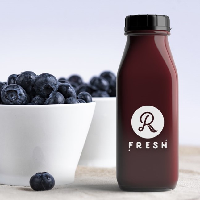
R Fresh opened in December 2016, serving healthy, tasty food and drinks to discerning Jersey foodies. As the new kid on the block they needed to make a big impression, fast. The website was the first implementation of the new brand: we breathed life into the concept, carefully representing the distinctive products and values to a new audience. Fresh!
- Brand positioning
- Copywriting
- Digital brand extension
- Content production
- Website design & build
- In-store feedback app

Bringing a new brand to life
R Fresh existed as a brandmark and development menu, but the first outlet was still weeks away and the packaging design just a concept. We were tasked with establishing a clear tone of voice and developing a distinctive design and personality from scratch. We like juice, and we love a challenge.


Research research research
The R Fresh concept offered new ideas and new flavours to the people of Jersey. We listened carefully to the owner’s vision, then looked to independent cafes in creative enclaves like Broadway Market, London & Fitzroy, Melbourne for inspiration. To stand out in a crowded market, we wanted to present a distinctive 'counter culture' for R Fresh.

Know your customer. But challenge them too.
We understand what works well in Jersey, but we also know that people love new places and fresh ideas. We were careful to get the balance just right - to sprinkle the familiar and trustworthy with just the right amount of excitement. We wrote a clear positioning statement as the blueprint for our design process, ensuring we hit the mark.

Attract, intrigue, explain
We established a distinctive tone of voice that captured the enthusiastic, friendly and energetic feel of the business. Visit the website, and you get R Fresh. Clever straplines communicate the overall offering, while well-crafted copy gives a tempting insight into the products and service.
Small but powerful
The initial requirement was for a small website to promote the launch of the business. We designed and built a clean, contemporary grid-based site with a clear hierarchy. The target audience are young, tech-savvy and on the move, so the site looks great on mobile. It's designed to be scalable, incorporating additional content and sections as the business develops and grows.


Naturally good,made with love
In one page we tell the whole R Fresh story, from locally-sourced ethical ingredients to the friendly 'counter culture'. Prior to the shop-fit and official photography, we sourced a library of stock photos for the website. We also identified key concepts that were used for in-store signage and campaigns on social media, such as 'Like Healthy, Love Taste' and #saladlife.
The customer is always right
Great customer service is a fundamental part of R Fresh. To help achieve the exceptional standards they aspire to, we designed and built a simple app enabling customers to give feedback on the service they received at the point of payment.

R Fresh is a great business, with superb food and drinks, and it was a privilege to communicate that online. Our achievement was to take nothing more than a logo and a vision, then shape it into something tangible, coherent and aspirational. Something small, but perfectly formed. It's also really satisfying when things we do digitally make their way into the real world, such as the straplines featured on the R Fresh shopfront.
www.rfresh.je
Have a project in mind?
Contact us
Other projects you may like
Jersey Electricity
Powering a zero carbon future
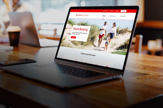
Santander International
Giving Santander International a digital boost
RPS