
Richard Hardy
Creative Director

Richard Hardy
Creative Director
5th December, 2025
Read time: 4 minutes

You’ve probably experienced this, or something similar. You walk into a bakery to buy a cake, excited for the treat that lies ahead. And you’re met with fifteen options: chocolate fudge, red velvet, lemon drizzle, something gluten-free and six with frosting you’ve never heard of.
Instead of joy, you feel indecision. The more options you see, the harder it is to choose.
That’s choice overload. And it’s everywhere, from bakeries to hotel bookings to hiring a lawyer.
In digital design, we celebrate giving users control. But when a page offers too many paths, too many profiles or too many 'contact' buttons, it creates friction instead of control.
There’s a reason this happens, and it’s not just cluttered screens.
The Hick-Hyman Law, a principle from cognitive psychology, shows that the time it takes to make a decision increases with the number of available choices. So the more options we give our users, the harder it becomes for them to decide confidently, and the longer it takes.
When that happens online, hesitation turns into frustration. Users lose focus, question their choices and often abandon the task altogether.
Simplifying the number of paths, buttons or filters doesn’t limit choice. It removes friction.
Good design doesn’t just present options. It helps people make decisions easily, and feel right about them afterwards.


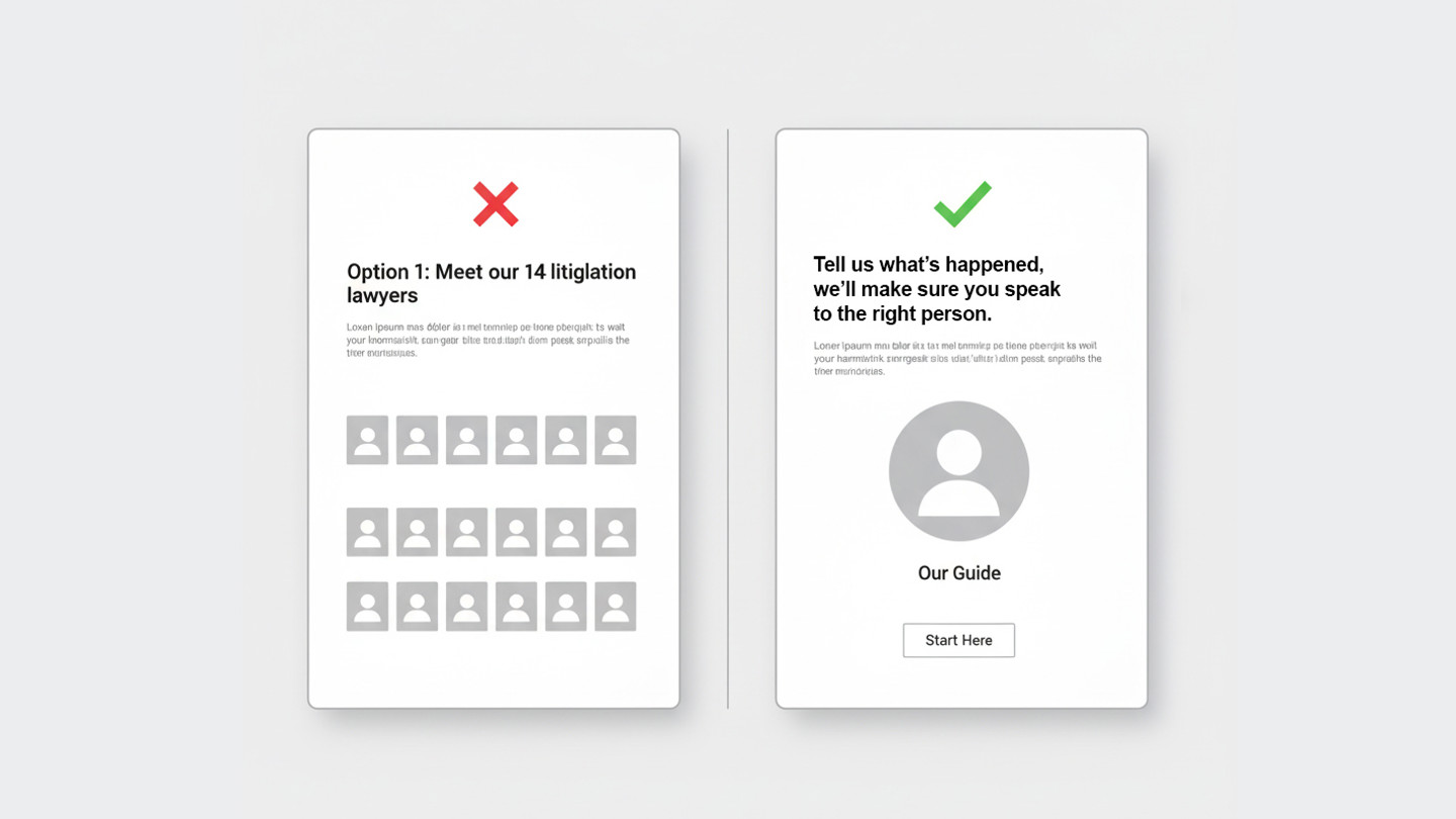
Legal services pages are a perfect example. Many firms proudly display their expertise by listing every partner, associate and specialist for each area of law. But to a potential client, this can feel like walking into that bakery again. Only this time, the stakes are higher and the fear of choosing wrong is real.
People don’t want to decode your team structure. They just want to know who to talk to.
UX research consistently shows that users prefer clarity over completeness. When everything is highlighted, nothing stands out.
The solution isn’t to hide expertise. It’s to organise it around user intent.
That’s where triage comes in: one clear point of contact who listens, understands the issue and connects the client with the right specialist. The content should mirror that process: simple, structured and human.
Instead of “Meet our 14 litigation lawyers”, think:
“Tell us what’s happened. We’ll make sure you speak to the right person.”
It’s a small change in language but a big step in experience.
Every page should help the user take the next logical step, not every possible one. That means one clear call to action, not a grid of phone numbers. One contact form, not a carousel of experts.
The same principle applies to navigation. A single, well-labelled route to “Talk to us” builds trust faster than several competing options. Visitors shouldn’t need to explore to start a conversation.
When choice is reduced thoughtfully, confidence grows.
A clear layout signals professionalism and focus. A single named contact builds reassurance. Users feel guided, not sold to.
For law firms and other professional services, this approach doesn’t just make websites easier to use. It reflects how clients want to be treated: with understanding, efficiency and care.
When we help users make confident choices, we build stronger relationships.
Less noise, more trust.
Fewer clicks, faster clarity.
That’s the difference between showing expertise and designing for experience.
Richard Hardy
Creative Director
Contact us
Need help simplifying your digital experience?
Get in touch with Richard Hardy, our Creative Director, to explore how we can help your website feel effortless to use.
No Content Set
Exception:
Website.Models.ViewModels.Blocks.SiteBlocks.CookiePolicySiteBlockVm